Gnome 3: go to Shell? Not just yet, thanks.
In Debian Unstable the transition to Gnome 3 is taking place; when Gnome 3.0 firstly came out some unnamed geeky users complained loudly about the design decisions of the development team to push strongly towards gnome-shell as a new default UI; gnome-shell was designed focusing on usability (usability is a metric relative to a certain target audience BTW) and simplicity, hiding a lot of details from the users. Obviously you can never make everyone happy so some of us simply happened to be “out of target”: you know us computer people (*cough cough*), we like to be in charge and control The Machine...
I must admit I still don't have a definitive opinion about the gnome-shell concept, for now I just know that it does not suit me; I am going to try it eventually, maybe I'll get used to it, but in the mean time I need my desktop back just like I shaped it through the years; can this be done without loosing all the good Gnome technologies (Empathy over all of them)?
To be completely fair I have to say that there is little to complain about with Gnome developers, we can still get our good old GNOME desktop fully back by using the fall-back mode based on gnome-panel and live happily ever after, let's take a look at how this can be accomplished.
NOTE: GNOME people state that the fall-back mode is meant for systems with older graphic cards which cannot run gnome-shell, however it can very well be seen as a good opportunity for those who do not want to run gnome-shell just yet.
Getting back to the topic: some minor touches are needed to make the panel look more like what we are used to, maybe some of these settings could even become default for fall-back mode, we'll see.
First, enable fall-back mode (on Debian there is a dedicated session you can choose from the Log-in Manager for that) and change some desktop settings, in a terminal type:
$ gsettings set org.gnome.desktop.session session-name 'gnome-fallback'
$ gsettings set org.gnome.desktop.interface 'menus-have-icons' true
$ gsettings set org.gnome.desktop.interface 'buttons-have-icons' true
$ gsettings set org.gnome.desktop.background 'show-desktop-icons' true
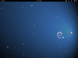
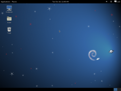
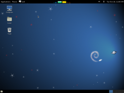
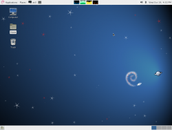
gnome-tweak-tool can be used for some of these settings like shown in the attached images.
Then rearrange the applets on the panel as you please (use Alt-RightClick to access the panel properties), and fix the theming using this patch to have a light panel again (against gnome-themes-standard=3.0.2-1):
$ mkdir $HOME/.themes
$ cd $HOME/.themes
$ cp -r /usr/share/themes/Adwaita Adwaita-fallback
$ cd Adwaita-fallback
$ patch -p1 < $HOME/adwaita-fallback-panel-theme.patch
$ gsettings set org.gnome.desktop.interface 'gtk-theme' 'Adwaita-fallback'
Some final touches for the Metacity window manager and to the clock applet, and we are all set:
$ gconftool-2 --type string --set /apps/metacity/general/focus_mode mouse
$ gconftool-2 --type boolean --set /apps/metacity/general/compositing_manager true
$ gconftool-2 --type string --set /apps/panel3-applets/clock/custom_format '<span color="#333">%a %d %b</span> <b>%H:%M</b>'
$ gconftool-2 --type string --set /apps/panel3-applets/clock/format custom
Ah, in the new gnome-panel based on Gtk3 there are still some details to take care of, I hope issues like that will be addressed and that the panel will be supported for quite some time.
Update for Gnome 3.4:
Since Gnome 3.4 it is not enough to just patch the installed theme, the theme should be rebuilt after it has been patched, these are the instructions to do that for gnome-themes-standard 3.4.2 using the newly attached patch for it (you may need to install some packages like gnome-common and librsvg2-dev for the build to succeed):
$ mkdir $HOME/.themes
$ cp -r /usr/share/themes/Adwaita $HOME/.themes/Adwaita-fallback
$ git clone git://git.gnome.org/gnome-themes-standard
$ cd gnome-themes-standard
$ git checkout 3.4.2
$ wget http://ao2.it/sites/default/files/blog/2011/10/19/gnome-3-go-shell-not-just-yet-thanks/gnome-themes-standard-3.4.2-adwaita-fallback.patch
$ git apply gnome-themes-standard-3.4.2-adwaita-fallback.patch
$ ./autogen.sh
$ ./configure
$ make
$ cp \
   themes/Adwaita/gtk-3.0/gtk-dark.css \
   themes/Adwaita/gtk-3.0/gtk.css \
   themes/Adwaita/gtk-3.0/gtk.gresource \
   themes/Adwaita/gtk-3.0/settings.ini \
   $HOME/.themes/Adwaita-fallback/gtk-3.0/
$ gnome-panel --replace
I am considering putting online my Adwaita-fallback fork as a git repository, let me know if there is enough interest about that.


![Validate my RSS feed [Valid RSS]](https://ao2.it/sites/default/files/valid-rss-rogers.png)

Comments
Hi Antonio, how are you
Hi Antonio,
how are you doing?
I haven´t checked Gnome 3 out yet, but will do so as soon as I have upgraded my Ubuntu (yeah, I am with stupid :D) to the current version (I am living in Munich now and don`t have a proper internet connection yet). I think Gnome 3 looks awesome, but that doesn´t mean it´s usable..
What I am excited about in GTK+ 3.* is that "Broadway" thing, which could really help to bring GPL'ed applications to closed platforms like iOS without VNC.
Best regards,
Peter
Hi Peter, I am doing fine,
Hi Peter, I am doing fine, thanks.
Yes, “Broadway” (HTML5 backend for Gtk+) is really interesting, I too am curious to see how we will use it.
Take care,
Antonio
Personally, both the new
Personally, both the new Gnome and Unity (as a fun of Ubuntu, I have to cite it) leave me "puzzled".
As a strong Mac OS X user, those 2 projects fail to marry simplicity with a feeling of "round and complete". Whenever I'm on Unity I feel like "stuff is hidden from me". I need to know the name of applications to run them (either by CMD+R or CLI). Yes, I can open the menu deep down to show more apps but... that's what I mean with hidden.
Gnome 3... I tried, and tried, and tried. It's "incomplete". It's a bit "crippled" because it is a work in progress and not everything I was accustomed to is there. Yes, is beautiful and pleasing for the eyes (for me, more than Unity is) but, still... on Mac I'm always a very little step away from stuff I want to run.
You are right, they can't please everyone. But the direction those 2 are taking, of hiding instead of "integrating" is a buzz killer for anyone that knows more than just "point-click" interfaces.
BTW, You have been featured on OSSBlog?
Congrats ;)
Hi Ivan, I didn't even know I
Hi Ivan, I didn't even know I was being picked up by OSSblog. Good.
The way I see it: all the people involved with GNOME are doing an amazing job with the platform infrastructure (Gtk, telepathy, gstreamer), and the fact we don't like the new UI might mostly be our fault because we know (or think to know) too well “what we want” :) and that makes the resistance to changes increase.
So the bottomline is: as long as I can get what I want in fallback mode I am not going to complain too much, I just let other be part of the gnome-shell experiment and I am going to try it from time to time to see if it's become ready for me.
Antonio mi diresti dove posso
Antonio mi diresti dove posso scaricare il wallpaper che hai usato per gli screen...è fantastico
Franci
È quello del tema di default
È quello del tema di default di Debian Squeeze, che si chiama SpaceFun; in particolare gli sfondi sono qui.
Hello! Are you going to
Hello! Are you going to submit your Adwaita patch to GNOME? It really needed a better gnome-fallback compatibility... thank you very much!
Matteo, I can try but I have
Matteo, I can try but I have the feeling that they will refuse to merge it.
This is my guess: Gnome developers really want fall-back mode to look as much as possible like gnome-shell, so if Adwaita provides a black panel in “shell” it has to style a black panel in fallback mode too, because that's a forward compatibility mode, something meant to be temporary (up to when the user can finally enjoy gnome-shell).
I think to it more like a classic mode instead (for backward compatibility if you want), so I tried to recreate the look and feel of 2.32 with the panel color following the Gtk theme base color.
What about the panel height?
What about the panel height? Can you get it back to 24px. I could not.
I do not know if that limit
I do not know if that limit comes from the particular theme.
Anyhow, I see there is a rough patch for that in Gnome 3′s fallback mode minimum panel size.
the patch does not apply
the patch does not apply against gnome 3.2.1
True, the patch is against
True, the patch is against
gnome-themes-standard=3.0.2-1.These are the directions to have the equivalent with other versions, in the guide above, instead of running the
patchprogram:$HOME/.themes/Adwaita-fallback/gtk-3.0/gtk-widgets.css.gnome-panel-menu-bar { -PanelMenuBar-icon-visible: true; } NaTrayApplet { -NaTrayApplet-icon-padding: 6; -NaTrayApplet-icon-size: 16; }This could even become a “sed patch”, but I don't feel like reviving my sed skills right now.
E' da molto che uso Fedora +
E' da molto che uso Fedora + GNOME in ufficio, ma dalla versione 14, quando è arrivato GNOME3, sono passato a XFCE, non ce la faccio proprio ad usare quella cavolo di shell....anche la modalità fallback secondo me non è come il vecchio GNOME2, mi dava problemi pure quella. Secondo me dovevano metterla semplicemente come alternativa al panel classico ma lasciare comunque il panel classico con tutte le features che aveva e non castrarlo come hanno fatto.
I've been using the new Gnome
I've been using the new Gnome 3 for a while now, and despite its shortcomings, it has increased my productivity. You can see how much potential it has, especially given new multi-gesture mouse pads coming on these days... Hats off to the Gnome developers for dragging us into the future.
I installed ubuntu 11.10 and
I installed ubuntu 11.10 and was baffled at Unity. It's just plain slow and hard to understand. So I decided to give Gnome Shell a try... and it rules. Just the CMD key functionality is much better (speed, functionality, etc.) and takes away some mouse errors (like I always accidentally click the Unity launcher when it pops up and libreoffice starts).
I'm still using it, but now I remember why I've been using Windows again for some time... since the launch of Unity in April I stopped enjoying my linux desktop, and Gnome Shell is making it good again.
Now, if something could be made about that silly "alt-click" thingie to power off and the search prompt had actual Tracker integration... It's funny that I don't miss the minimize button at all.
Hey Folks, I just stumbled
Hey Folks,
I just stumbled upon this page and thought I'd say thanks for the info.
May I also add that you should all be more vocal about the obtrusiveness of Gnome 3 - recent releases in the world of Linux UX (Unity, KDE4, GNOME3) are all adding to the suffocation of Linux. The market share for this awesome (set of) OS will remain at 1% unless something is done .... ;)
Up until Fedora 17 this patch
Up until Fedora 17 this patch worked well and gave me happiness. :))
Now with fedora 17 and gnome 3.4 the theme has changed enough that I don't really know where to intervene. By now I'm using the patched theme from F16, but it is not working well.
Does anyone know how to properly patch the new theme?
Hi Dave, I've added some info
Hi Dave, I've added some info about Gnome 3.4.
Let me know if that is enough.
Ciao, Antonio
Ciao Antonio, I just tested
Ciao Antonio,
I just tested your new instructions. They work and the result is more than enough to make me happy again.
Believe me, this patch is a life-saver. I tried most white-ish themes from deviant-art, and none is working well with the current gnome.
You may want to specify a couple of dependencies that are not in the fedora default install:
gnome-common librsvg2-devel.The only nuisances encountered so far are:- the new scollbars, which are dark, while I'd like them white.
- the low contrast in the selected items on the taskbar. (See http://files.myopera.com/ReD/Pubblicate/15.png)
- the icon padding in the top bar and in the notification area, which I'd like to reduce. (in the 3.2 theme I was using
- the size of the icons. (in the 3.2 theme I was using
-NaTrayApplet-icon-padding: 0;)-NaTrayApplet-icon-size: 18;)Ciao e Grazie,
Dave
> the new scollbars, which
> the new scollbars, which are dark, while I'd like them white.
... o meglio ancora azzurre...
Thanks for the info about the
Thanks for the info about the missing dependencies Dave, article updated.
Icon size and padding are broken in gnome-panel itself AFAIU, it's not just a theme issue.
About the other details, what about sending a patch? :)
Instead of working on a
Instead of working on a patch, I'm trying an alternative approach that is easier to apply and quicker to test.
The following css goes into a file named "gtk.css" in the user home directory under ".config/gtk-3.0" (which may have to be created) and it works with the default gnome theme.
The css is based on your patch, but is slightly different and not particularly beautiful, nor complete... I'm still looking how to do some things as for example, adding a border to menus or adding spaces between elements in the task-bar so that borders do not touch.
btw: I Hate css, you never know what it applies to... it is unreadable as hell and themes are mostly undocumented. Bah!!!
Anyway here is my attempt:
@define-color os_chrome_bg_color @theme_bg_color; @define-color os_chrome_fg_color black; @define-color os_chrome_selected_bg_color #5aa0e9; @define-color os_chrome_selected_fg_color black; @define-color fallback_selected_bg_color #5aa0e9; @define-color fallback_selected_fg_color white; @define-color chrome_bg_color #1e1a17; @define-color chrome_fg_color #fff; @define-color keyboard_focus_border_a #a2c9f1; @define-color keyboard_focus_border_b #6794cf; /********************** * Fallback Mode Panel **********************/ .gnome-panel-menu-bar { -PanelMenuBar-icon-visible: true; } .gnome-panel-menu-bar, PanelApplet > GtkMenuBar.menubar, PanelToplevel, PanelWidget, PanelAppletFrame, PanelApplet { background-color: @os_chrome_bg_color; background-image: none; color: @os_chrome_fg_color; } ClockBox, .gnome-panel-menu-bar.menubar, PanelApplet > GtkMenuBar.menubar { font: -bold; } .gnome-panel-menu-bar.menubar .menuitem *:hover, PanelApplet > GtkMenuBar.menubar .menuitem *:hover { text-shadow: none; } .gnome-panel-menu-bar.menubar .menu, PanelApplet > GtkMenuBar.menubar .menu { font: regular; } .gnome-panel-menu-bar.menubar .menu *:hover, PanelApplet > GtkMenuBar.menubar .menu *:hover { text-shadow: none; } .gnome-panel-menu-bar .menuitem:hover, PanelApplet > GtkMenuBar.menubar .menuitem:hover, .gnome-panel-menu-bar .menuitem *:hover, PanelApplet > GtkMenuBar.menubar .menuitem *:hover { background-color: @os_chrome_selected_bg_color; color: @fallback_selected_fg_color; } .gnome-panel-menu-bar .menuitem *:hover, PanelApplet > GtkMenuBar.menubar .menuitem *:hover { color: @fallback_selected_fg_color; } PanelApplet .button, PanelApplet .button:hover { padding: 4px; border-image: none; border-width: 0; border-radius: 0; background-image: none; background-color: @os_chrome_bg_color; color: @os_chrome_fg_color; text-shadow: none; } PanelApplet .button:active:hover, PanelApplet .button:active { border-image: none; background-image: none; background-color: @os_chrome_selected_bg_color; border-width: 0; border-radius: 0; } /* Agisce sul clock */ PanelApplet *:hover { color: @os_chrome_selected_fg_color; } /* Agisce sul clock */ PanelApplet *:active, PanelApplet *:hover:active { color: @fallback_selected_fg_color; text-shadow: none; } NaTrayApplet { -NaTrayApplet-icon-padding: 2px; -NaTrayApplet-icon-size: 16px; } WnckPager, WnckTasklist { background-color: @theme_bg_color; background-image: none; color: @theme_text_color; } WnckTasklist .button, WnckTasklist .button:hover, WnckTasklist .button:active, WnckTasklist .button:active:hover { border-width: 1px; border-radius: 4px; border-color: #888; } WnckTasklist .button:hover, WnckTasklist .button *:hover { color: @theme_text_color; background-color: mix(@chrome_bg_color, white, 0.8); text-shadow: @button_text_shadow 0 0; } WnckTasklist .button:active { color: @theme_text_color; background-color: mix(#5aa0e9, black, 0.1); text-shadow: @button_text_shadow 0 1; } WnckTasklist .button:active:hover, WnckTasklist .button *:active:hover { color: @button_active_text; background-color: mix(#5aa0e9, black, 0.2); text-shadow: @button_active_text_shadow 0 0; } GsmFailWhaleDialog { background-color: @os_chrome_bg_color; background-image: none; color: @os_chrome_fg_color; } GsmFailWhaleDialog .button, GsmFailWhaleDialog .button:focus, GsmFailWhaleDialog .button:active, GsmFailWhaleDialog .button:active:focus { border-image: none; border-color: @borders; border-width: 1px; } /* gnome-screensaver lock dialog */ GSLockPlug .frame { border-color: @borders; border-width: 1px; border-style: solid; border-radius: 0; } /************** * Scrollbars * **************/ .scrollbar { -GtkScrollbar-has-backward-stepper: true; -GtkScrollbar-has-forward-stepper: true; }The code statement did not
The code statement did not work well, so here is a download link for the file.
https://dl.dropbox.com/u/6803261/gtk.css
Post new comment