Seasonal plots, with gnuplot
Sometimes there is the need to plot some events which have a periodic trend.
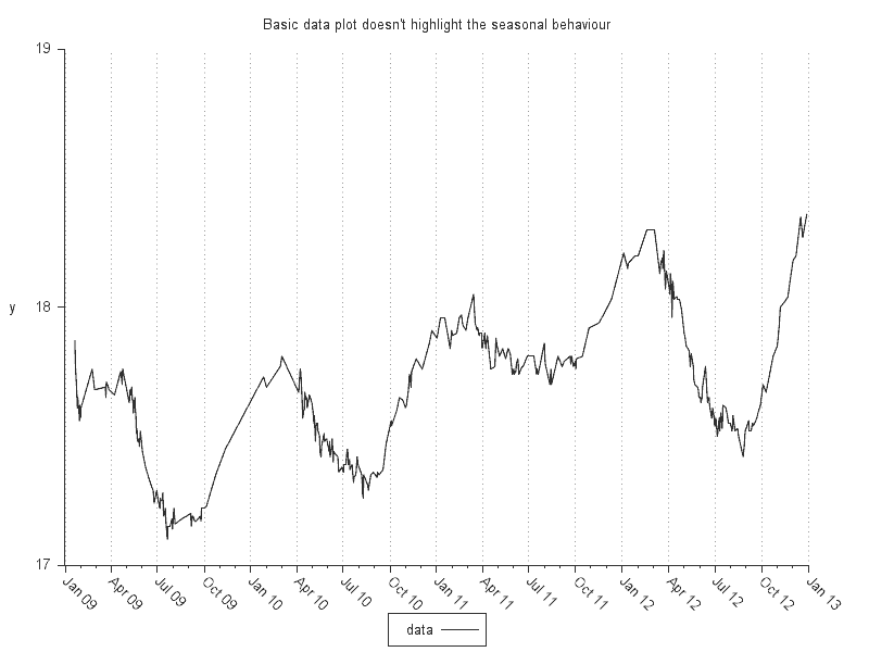
Let's consider a seasonal phenomenon; a typical plot may not fully highlight the regularity of the periodic behavior:
In these cases, giving visual clues to compare the data points which are in the same time of the year allows to see more clearly how much the behaviour is regular in the periodicity interval.
Several approaches can be taken:
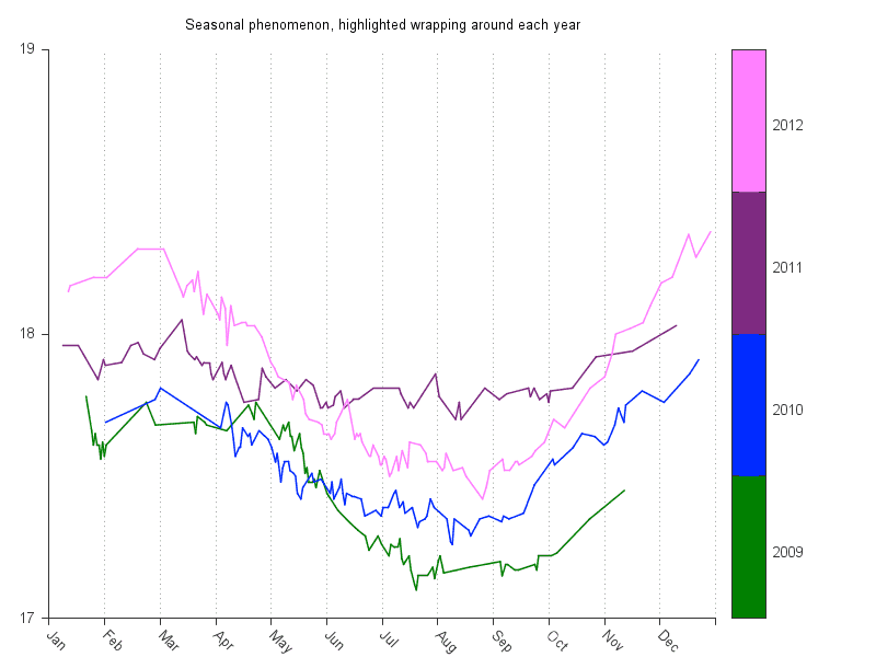
The x axis can be made modular so that events occurring in the same time frame in a given interval can be easily compared:
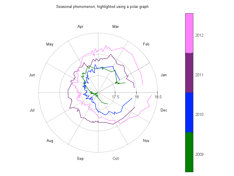
The modular domain can be considered in polar coordinates too:
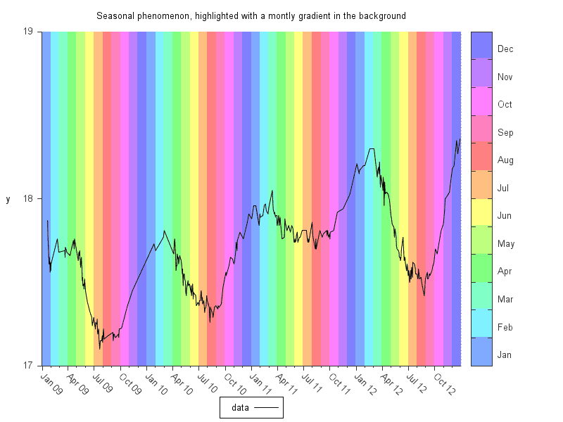
Months can be highlighted in the background when using the full range:
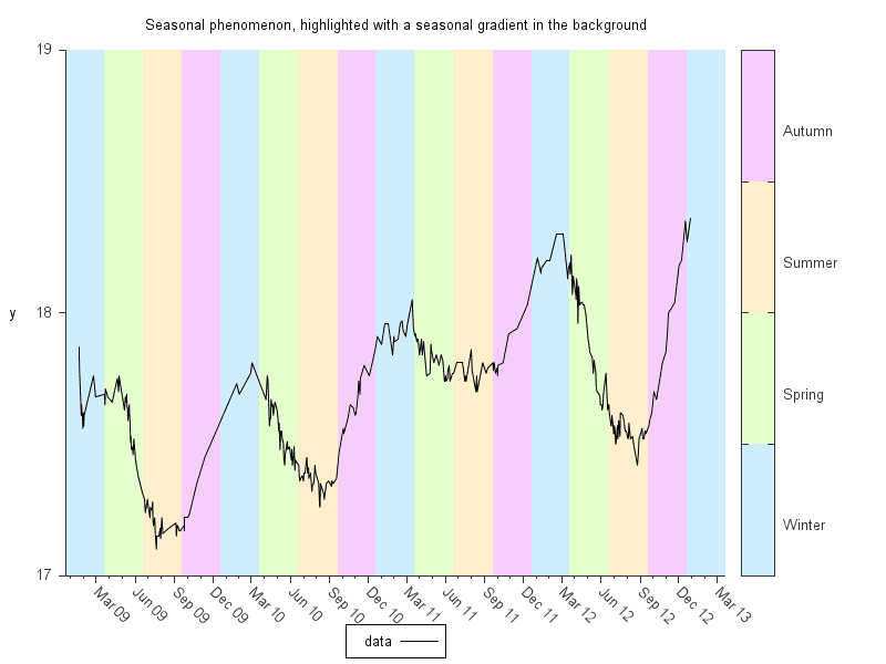
Seasons can be highlighted in the background when using the full range:
With these plots it can be seen more clearly that the maxima are at the end of the winter and the minima are during the summer.
The plots above were made with gnuplot, the scripts for them can be found in the gnuplot_seasonal_plot git repository.
In order to draw the labels of the color box correctly in the polar plot, a version of gnuplot with bug #1569 fixed is required.
Some quick tests about seasonal arithmetic are also collected in the season_math_test git repository.



![Valida il feed RSS [RSS Valido]](https://ao2.it/sites/default/files/valid-rss-rogers.png)

Commenti
Invia nuovo commento